A sample of our work — from startup to F500


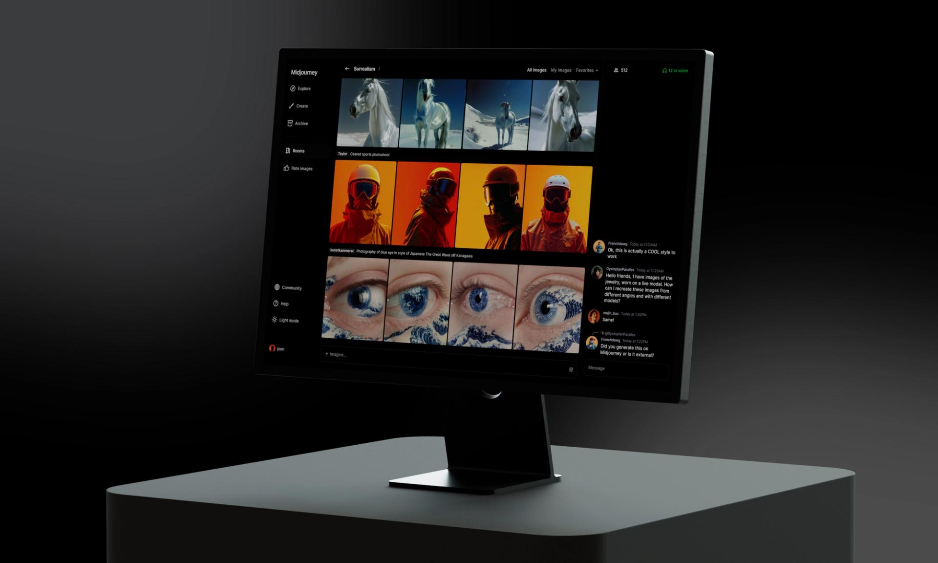
Crafting the original interface for the world's leading prompt-to-image AI service.


An ongoing partnership with Nike focused on high-impact work across product strategy, creative design, and early concept development for their core app and new digital platforms.


Partnering alongside Loom's in-house product teams on future state feature ideation and product concepting to improve discoverability, retention, and engagement.


A mobile and desktop overhaul for the category-leading grocery delivery app, featuring over a dozen new features and a progressive roadmap to boost conversion and cart performance.


Dating back to our origins as one of our first clients, we have since partnered with Apple on various projects through the years.


Close collaboration inclusive of a rebrand, new website and UX/UI services for a hyper-growth startup providing clean, energy-efficient cloud computing for the AI and blockchain industries.


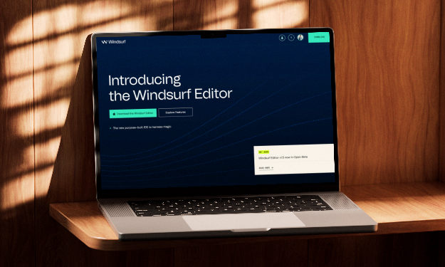
A comprehensive rebrand for the world's leading AI code assistant trusted by millions of developers worldwide.


Partnering closely alongside in-house teams on a rebrand, UX/UI design and engineering services to build and iteratively release an original product to help bring AI services to enterprise at scale.


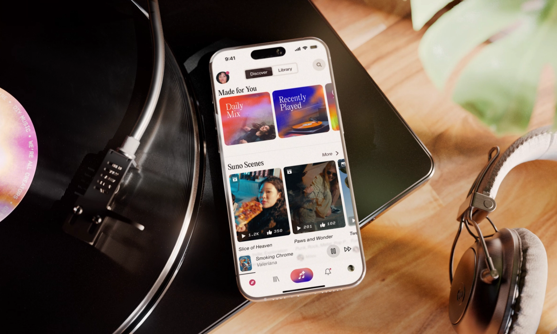
Democratizing the music creation process with a prompt-to-song platform.


Pinterest co-founder Ben Silbermann approached us to help validate and conceive a new product for a startup that helps people better understand their emotions.


Close collaboration on a first iOS application in design and engineering for the world's leading prompt-to-video platform.


Close partnership with Microsoft Mahi designing an interface to initially set up and connect IoT devices to hardware, ensuring proper configuration.


Partnering closely with the internet giant across a number of products, feature sets, and R&D initiatives over years.


Close collaboration with the Fanatics Live design team to bring delightful moments to life with crafted motion and interaction design.


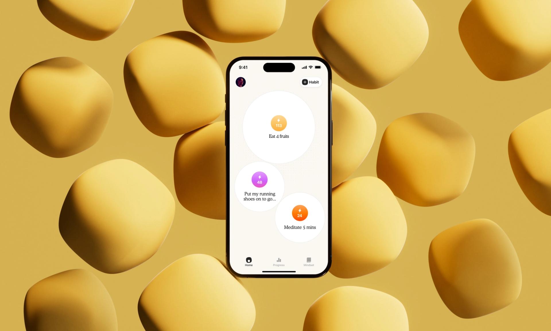
Creating the official Atomic Habits app.


Redefining the Yahoo Sports experience by modernizing a legacy product for millions of Fantasy and Sports fans.


Working alongside Chris Lattner and the founding team at Modular on brand and holistic product design for a pioneering AI developer platform now valued at $600M.


Close collaboration with Gather to rethink and redesign the core platform as a leading remote work experience.


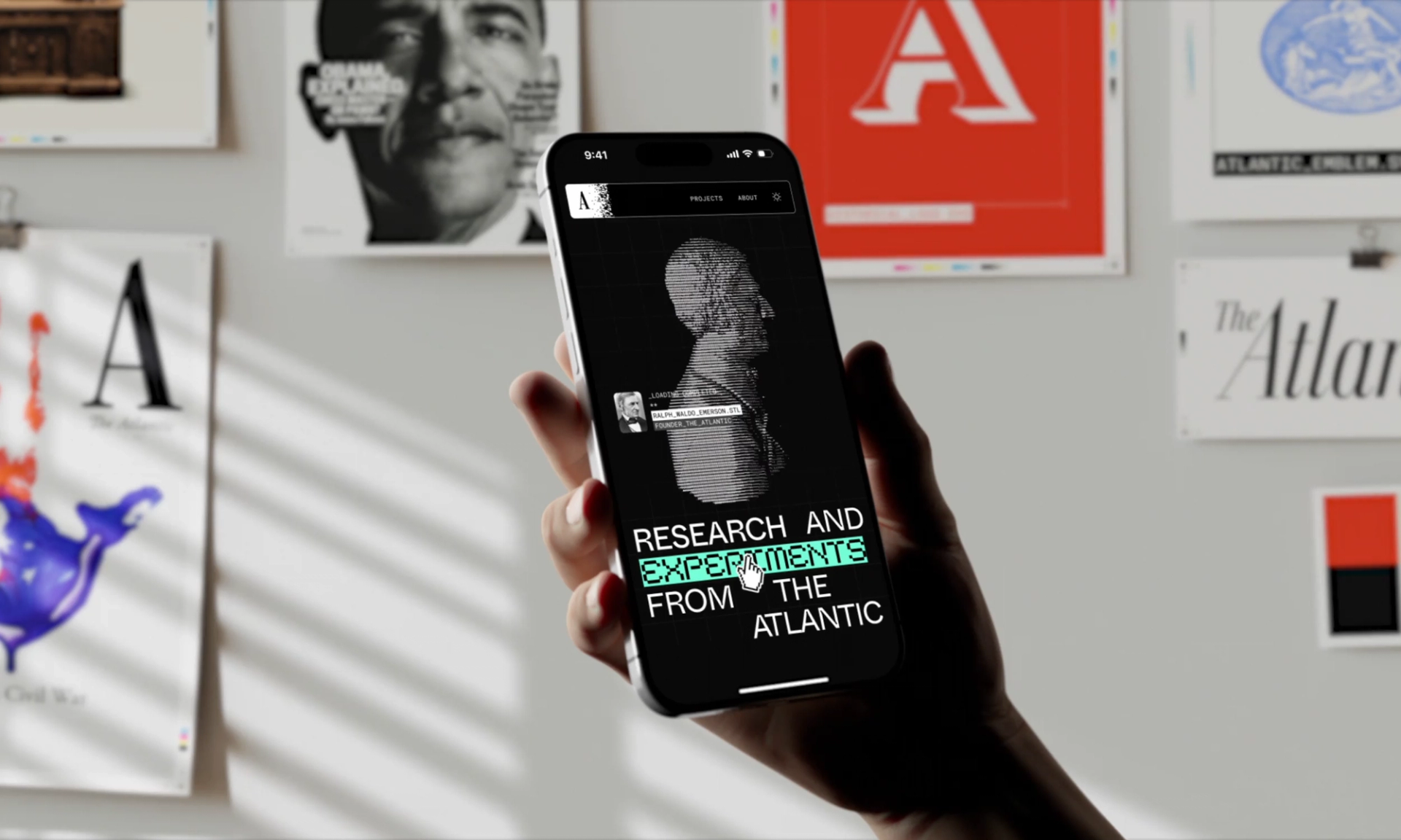
Building a safe and responsible framework for The Atlantic to explore AI for years to come.


A bold new brand identity and optimized mobile app experience for Somnee as they launched their V2 headband, fresh off funding and major partnerships with the NBA and Equinox Hotels.


Trusted partner of the social media giant in product design, research, engineering, and R&D. We had the name first.


Design and visual identity for AI pioneers and researchers at Together.ai responsible for the creation open and transparent cutting-edge artificial intelligence tools such as Llama.


Visual redesign and design system work for the go-to creator monetization platform with a focus on community and content delivery.


Metalab reimagined Threads greyscale beta products for both Web and iOS to deliver core product refinements, killer interactions, and an intuitive sign-up and onboarding flow.


Foundational product design of the video player experience for Youtube still in use today.


As a leading AI-based automation startup, Bardeen approached us in the early days to help conceive and design a category-defining MVP.


Product concepting & future-state ideation on what Expensify can be for today and tomorrow.


Top to bottom brand and cross-platform UX/UI design to help Crypto.com become the world's largest cryptocurrency exchange.


Delivering a multi-modal experience vision to empower users through financial literacy and education.


Creating a category-defining brand and product for PlayerZero, helping engineering teams ship better software by catching bugs early and learning from every interaction.


We created a product-forward ecommerce and subscription service for the premium flash-frozen coffee company.


A bold redesign of the core webflow.com website, crafting a refined, high-impact web experience ahead of its relaunch at Webflow's flagship Conference.


Redesigning Everlywell’s digital ecosystem and vision to support growing offerings and sub-brands. The result: a clearer experience and lifts across checkout, membership, and cart performance.


A year-and-a-half-long engagement of carefully redesigning and rebuilding TripAdvisor's core mobile experience for 500M DAUs alongside the company's in-house teams.


Translating Docusign’s bold rebrand into an award-winning digital experience.


Conceiving an innovative new form of social investing, securing the company an additional round of funding post launch. Since acquired by Yahoo.


UX research, strategy, and redesign to scale the food and alcohol delivery platform valued at $15B.


Worked alongside Otter back when they were AISense to conceive the intelligent audio transcription tool named one of Forbes Best Generative AI Workplace Productivity Tools.


Collaborating closely with Atlassian’s in-house product teams on design ideation, research, and strategy for what went on to become Stride.


Delivering a new, and entirely personal, cart and checkout experience for the iconic brand.


Delivering an MVP and product roadmap for the creator economy’s go-to back office platform.


Redesign and replatforming of Summit Health and City MD’s 5 digital platforms prior to the $9B Walgreens deal.


Product and web design for the plug-and-play virtual testing infrastructure that leverages AI technology to scale robotics development.


Design, development, and strategy of the world's first online Notarization product from MVP to unicorn.


Brand design for the AI startup pre-inflection delivering the smartest email app on planet earth.


Close collaboration with one of the world’s largest neobanks to conceive a global design system and visual redesign.


Design and engineering of the online recovery school that has helped thousands of people rethink their relationship with alcohol.


Taking the productivity tool from a functional beta to a beautiful experience ready for primetime.


A long-term partnership bringing cohesion to Biograph’s luxury longevity clinics and digital platforms, from patient portals to in-clinic screens.


Conceiving a financial management startup from the ground up with the founding team.


Product design and UX research for the data annotation service training artificIal intelligence and machine learning models to improve image recognition.


Collaborating with NerdWallet to redesign and elevate their native app experience, better reflecting their brand value and standing in the marketplace.


Designing the future of fashion with a blockchain-enabled platform where users can curate, trade, and own digital fashion in a whole new way.


Original brand development and marketing site for the future of user data management for the advancement of AI.


We partnered with Stitch Fix ex-COO Julie Bornstein to create the hyper-personalized AI shopping platform that was soon acquired by Pinterest.


Creating a new visual foundation for Hinge Health that elevates core product experiences and streamlines implementation with a unified UI kit.


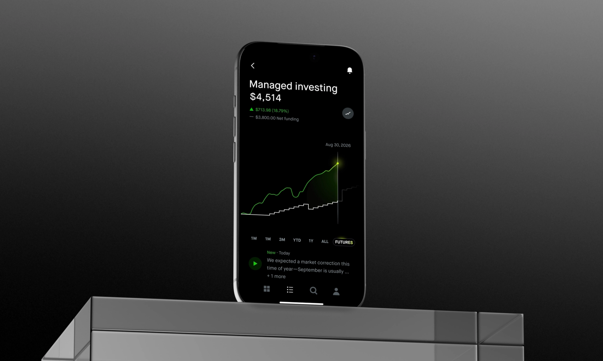
Rapid transformation and reconstruction of the high-net-worth wealth management platform transacting over $2T in assets.


Design, strategy, and build of the award winning TED Connect app.


Creating an immersive mapping & editorial product that allows users to discover Europe’s certified World Heritage sites like never before.


Modernizing Exiger’s brand and UX to consolidate their diverse offerings into one cohesive look and feel.


Building a new mobile experience for the platform making the internet safer for kids, including reimagined dashboards, streamlined controls, and a new feature that helps families celebrate small wins together.


Foundational research, concept testing, product definition, and design to imagine the future of virtual live streamed events across mobile and web.


Helping the news platform 4x engagement with an entirely redesigned native iOS and Android app.


A 10-year-longstanding client in design and engineering across Walmart's entire digital footprint.


Crafting a connected help experience across games, with a flexible design system, AI-powered tools, and tighter links between Help, Community, and Account to support discovery and engagement.


Design and strategy for the initial prototype of Musk’s brain chip companion app that trains people how to control their phone and computer with thought alone.


A fresh identity and marketing site to help position Fulcrum as a category leader in a legacy industry and attract top talent in a competitive market.


Moving the media giant beyond in-car entertainment and into wider omni-channel delivery to attract new audiences in the age of streaming.


A rebrand and rollout for one of the world’s fastest growing cybersecurity companies.


Bringing an AI agent to life through chat, making everyday tasks feel easy and fun by letting the AI take care of the hard parts.


Reimagining the home decor shopping experience from the ground up to deliver a visual-first, AI native platform for retail.


Conceived and designed the original product and brand for Clockwise, the smart calendar system that frees up time so that users can focus on what matters most.


Working closely alongside the Messenger team at Meta to convey what's possible with automated chatbots for an F8 reveal.


Crafting a new visual foundation and interaction paradigm for one of the most widely used financial platforms in the world.